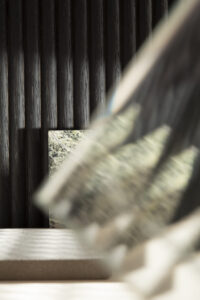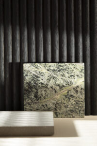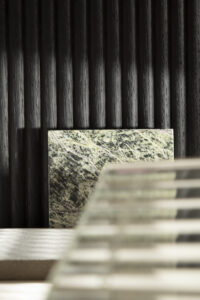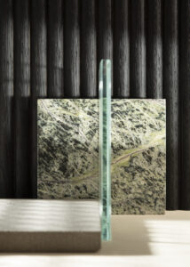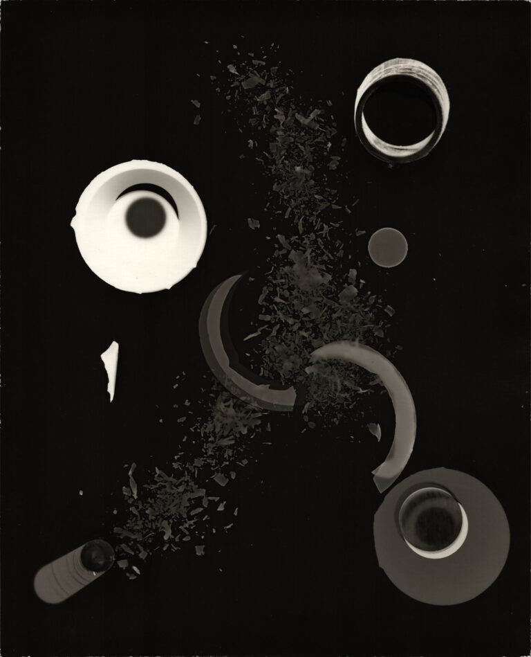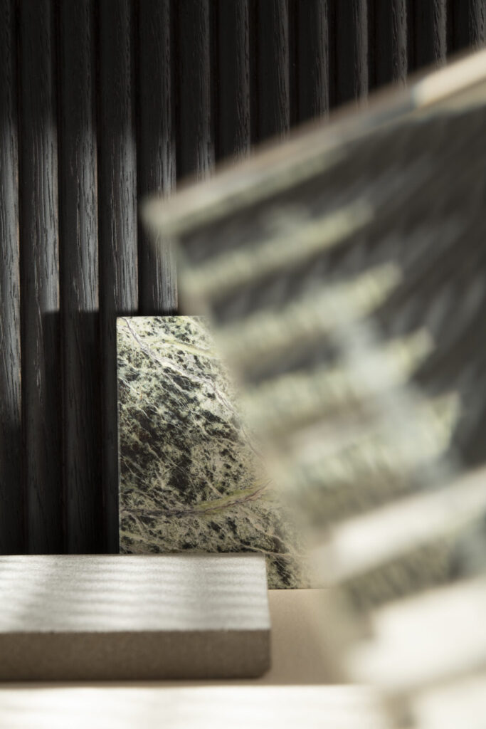
A material composition defined by the relationship between surface, texture and light. Three materials: breccia Imperiale green marble, ribbed glass and dark fluted wood create a balance of contrasts through different degrees of reflection, transparency and light absorption.
Breccia Imperiale, used by Cesar Cucine for its high-end collections and monolithic kitchen islands, is characterised by deep green tones, white veining and warm mineral inclusions. The patented Ipogeo® finish enhances its three-dimensional quality by alternating polished and matt surfaces, following the stone’s natural pattern.
Ribbed glass introduces a regular texture and a different perception of light. The horizontal or vertical orientation of the pattern alters reflection and diffusion, creating changing effects across the surface.
Dark fluted wood completes the composition with a greater capacity to absorb light. Commonly used for doors, bathroom systems and wall coverings, its vertical rhythm introduces depth and definition.
We were playing, an important phase in approaching creative design processes, so building this moodboard we privileged the physical perception of materials: polished and matt, reflective and absorbent, transparent and tactile: a preliminary design exercise in which light becomes a tool for defining the relationship between surfaces.